Website Heatmaps: Useful Behavior Data, or Just More Third-Party Bloat?
Website heatmaps can provide tons of insight on user behavior for specific web pages. But are they for everyone? I lay tactics for applying your heatmap data, and give scenarios where heatmap tools would be beneficial versus insignificant bloat for your site.


Website heatmaps can be incredibly useful for understanding visitor behavior the moment someone lands on your site.
Think of it like an X-ray scan for individual web pages that show where visitors click, move their mouse, scroll, or hover, helping you to understand what grabs their attention and what’s being ignored.
Instead of analyzing basic charts and graphs pulling data from spreadsheets, heatmap data shows you visually what’s working on your site and what may need improvement.
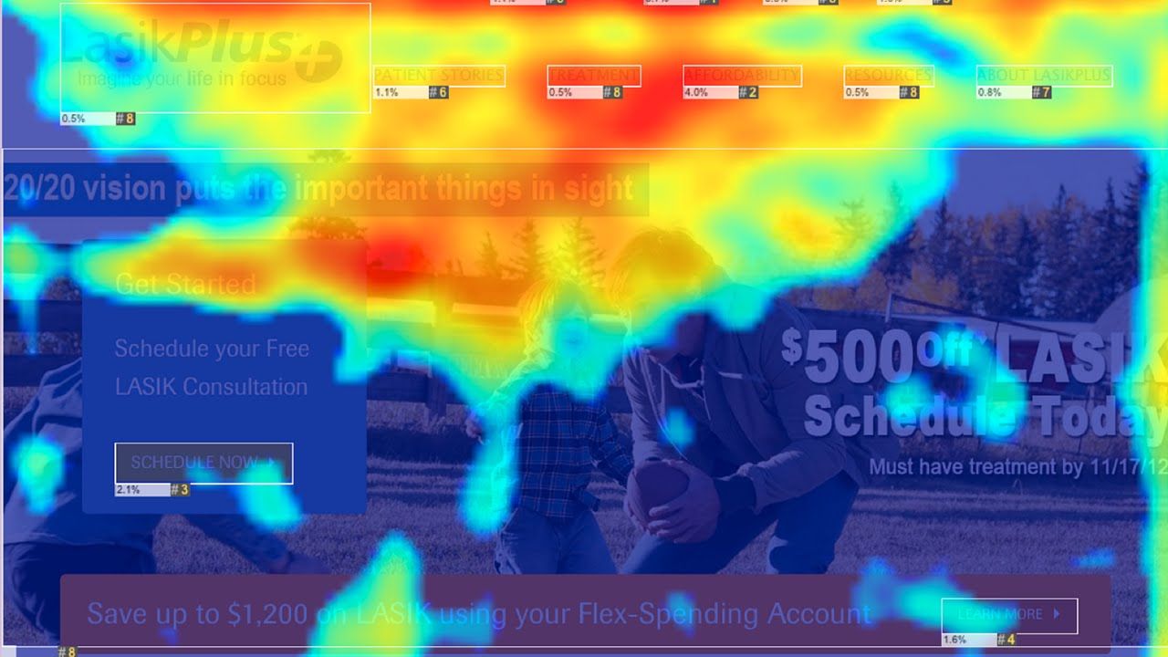
The data is visualized on a color scale – red signifying the hottest, most engaged areas, yellow average engagement, and blue is ice cold, low-to-no engagement. For non-technical marketers, visualizing page performance this way could be a game-changer.
While website heatmaps provide marketers with yet another tool at their disposal for improving site performance, like most SaaS out there, it doesn’t come without its drawbacks.
In this article, I’ll break down everything there is to know about website heatmap tools, how they work, their pros and cons, and by the end, you should have a better idea if this type of software can play well with the rest of your stack.
How do heatmaps gather results from your website?
Step 1. Data collection
Let’s say you chose a heatmap SaaS you’re happy with. You’ll be given a set of instructions to start tracking and recording user interactions on your web pages. This process involves:
- Installing your tracking code: Your website owner will place a JavaScript tracking code (provided by the heatmap tool) on the website. This script records the activity of each visitor on each web page you decide to track.
- Session recording: As visitors interact with your website, the tracking code records their behavior. This could include mouse movements, clicks, scrolls, and more depending on the heatmap type you select.
Step 2. Data aggregation
After collecting the data, the heatmap tool starts the process of compiling and organizing this data:
- Organizing the data: The tool groups the collected data, such as the number and location of clicks, into relevant categories.
- Aggregating your results: The tool aggregates the data from all visitors to give a comprehensive view of user behavior across the site. These results could take longer to process if you’re on a free versus paid plan, as this is the main monetization method of heatmap tools.
Step 3. Heatmap generation
With the collected and organized data, the heatmap tool creates a visual representation:
- Heatmap layering: The tool overlays a heatmap layer on the web page it screenshotted. The areas of high user activity are highlighted as 'hot' (usually in red), and the areas of low user activity are shown as 'cold' (often in blue).
- Levels of interactivity: The generated heatmap is interactive. Website owners can hover over different areas to see specific data, such as the number of clicks on a particular button.
Step 4. Analysis and reporting
The final step involves analyzing and interpreting the data to understand user behavior:
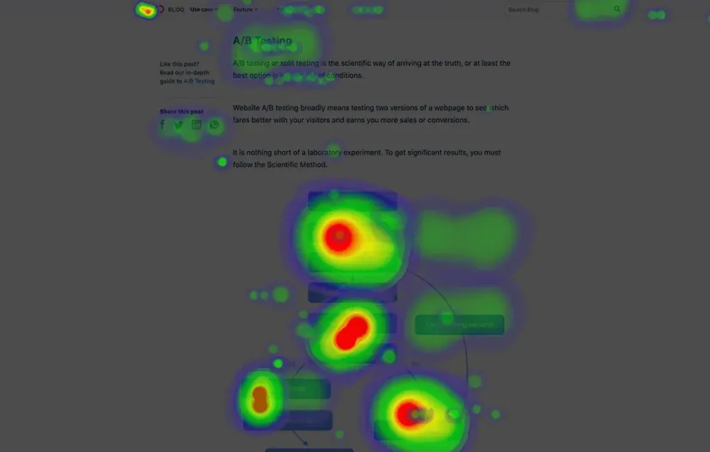
- Insight generation: The heatmap provides insights, such as which areas of the website are most engaging, where users are clicking, and how far they're scrolling.
- Reporting and sharing: Heatmap tools come with reporting capabilities, allowing you to track changes over time or compare different pages. You may also generate a shared link to a heatmap so you can send the results to your team and collaborate on a solution.
And that’s about it. Some heatmap tools come with premium features like gathering survey responses about your page experience, but for now, we’re focusing on the core features.
How can marketers apply their heatmap insights?
Gathering all this data from your website is for naught if you’re not sure how to apply it. Below are some experiments I’ve applied to real websites, as well as hypothetical examples, as methods to improve site performance.
Improve your conversion rates
Heatmaps can identify which parts of a page are attracting the most attention and which parts are being overlooked. For instance, if your main product page CTA is in a ‘cold zone’ and isn't getting much interaction, you can move it to a ‘hotter’ area where you notice hovers and scrolls are most prominent.
This method is more commonly referred to as Conversion Rate Optimization (CRO).
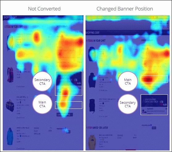
Example: An ecommerce site noticed that visitors weren’t clicking on the CTA at the bottom of their product pages. They decided to move the CTA higher on the page, resulting in a significant increase in added-to-cart rates.
Optimize your page layout
Page scroll length can have a direct impact on your time on page, which on average hovers around 52 seconds. My general observation is the longer you require someone to scroll and find relevant content, the less likely you’ll be able to influence a conversion.
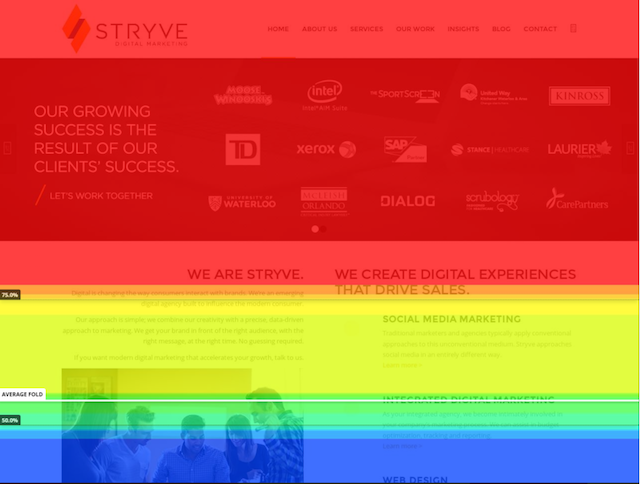
Fortunately, heatmaps provide insights into how far down your page visitors scroll, allowing you to strategically place important content or forms where they're more likely to be seen.
Example: A blogger used their scroll heatmap data to find out that the majority of visitors didn't scroll past the halfway mark. As a result, they decided to nudge their newsletter signup form and its welcome offer in the top half of the page, leading to higher signup rates.
Refine your content strategy
By tracking where visitors spend the most time on a page, heatmaps can provide insights into the types of content that your audience engages with most. This can help refine your content strategy to produce more of what works, and reduce what doesn’t.
Example: A news website found through heatmaps that visitors spent more time on infographics compared to text-based news. This led to a shift in their content strategy to produce more visual and interactive content, improving reader satisfaction.
Enhance your user experience
One of the best ways to reduce the risk of dogfooding your website user experience (UX) is through unbiased heatmap data.
If you notice that users are frequently clicking on elements that aren’t clickable, it can signal a design flaw that’s frustrating for users. This could be all it takes for someone to bounce from your site. Instead, making these elements interactive can significantly improve the UX and give users what they want.
Example: A travel booking site noticed via heatmaps that users were trying to click on images of destinations, expecting to see more information. Unfortunately, these were static images. To improve user experience, the site made the images clickable which led to improved time on page and increased bookings.
Remember, while heatmaps can provide valuable insights, it's important to interpret the data within the broader context of user behavior and not make hasty conclusions based on heatmap data alone. Complementing heatmap insights with other user data can result in a more effective and comprehensive optimization strategy.
5 reasons to be skeptical of heatmap data
1. Interpretation
Understanding the data from heatmaps isn't always straightforward. A 'hot' spot may just mean an element is distracting, not necessarily useful or engaging. Similarly, 'cold' areas might not always be problematic; they could be less important parts of the page.
Careful analysis and sometimes additional user research is needed to make sense of the heatmap data.
2. Lack of context
Heatmaps show where users interact most, but they don't explain why. For example, if users frequently click a non-clickable element, you can see this on a heatmap but you won't know why they're doing it. Complementary tools or methods, like user surveys, could be required for more comprehensive understanding.
3. Page layout changes
Heatmap tools sometimes struggle to adapt to dynamic or responsive website layouts. For instance, a website may look different on a mobile device versus a desktop, which can make it difficult to accurately interpret heatmap data across devices.
4. Inaccurate with low traffic
As mentioned previously, if you’re on a free versus paid plan with a heatmap tool, you’re going to be capped at a very low session recording amount. This could lead to an insufficient amount of user data to gather meaningful insights. For example, a session recording of 500 visitors will give you a much better idea of page behavior versus 50 visitors.
5. Sampling issues
Not all heat mapping tools track every visitor to your site due to technological constraints. Some use a sample to extrapolate results, which can lead to less precise insights.
With the right approach and careful interpretation, heatmaps can be an incredibly useful part of your website optimization toolkit. But please be aware of the challenges above when drawing your insights, especially if you’re a marketer with full control over website changes.
Added challenges with third-party applications
Today’s popular heatmap tools are delivered through third-party services. This means you incorporate them into your website by adding a piece of JavaScript code that is provided by the heatmap service, as I described earlier.
This script allows the service to collect data from your website's visitors to generate the heatmap. However, if you have lots of scripts running for every user session, you could potentially slow down your website and impact user experience. Here’s why:
- Download time: Each additional script that a browser needs to download increases the total amount of data it has to process. If the script file size is large, or the user's internet connection is slow, this can delay the loading of your webpage. We know that just a few seconds of delay can significantly impact your bounce rate.
- Execution time: Once the script is downloaded, the browser has to execute, or run it. This takes CPU time, which could otherwise be spent rendering your website’s content, such as your Largest Contentful Paint (LCP). If the script is complex or not optimized, it can increase the time users have to wait before they can interact with your website.
- Blocking rendering: Scripts, unless specified to be asynchronous or deferred, are render-blocking. This means the browser has to stop building the webpage and deal with the script before it can continue, which again can slow down the webpage load.
Below is a speed test analysis from Howuku on the impact third-party heatmap applications may have on page loading speed.
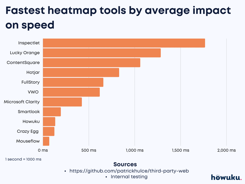
It’s important to note that not all third-party services will significantly slow down your website. Many heatmap tools are designed with performance in mind, offering lightweight, asynchronous scripts that have minimal impact on page load speed.
However, it's always good to monitor your website's performance after adding new third-party tools to ensure they don't negatively impact user experience. Be sure to run these speed tests in incognito mode so browser extensions won’t impact them.
How AI is tackling this issue
If speed is of utmost important to the performance of your website, check out what Wynter is doing. Wynter, a B2B message testing platform, is using AI to provide predictive heatmap results for your web pages without requiring scripts.
How to decide if a heatmap tool is right for you
What are your marketing objectives?
What are some of your north star goals over the next few quarters? If understanding user behavior, optimizing your website, and improving engagement and conversions are high on your list, a heatmap tool can be extremely valuable.
Do you have enough traffic?
Heatmap tools work best with a good amount of traffic to provide reliable and significant data. If your website has relatively low traffic, it will be more challenging to get meaningful insights from a heatmap.
What is your marketing budget?
There are many heatmap tools available, ranging from free (with limitations) to premium services. Decide how much you're willing to invest. Remember, it’s not just about the cost of the tool, but also the time and resources required to analyze and act on the data.
Do you have analytical breadth?
Yes, heatmap data can be valuable for visual interpreters, but it still requires a certain level of analysis to interpret the results correctly. Ensure your team has the necessary skills to make the most of the tool.
Does it play well with your current tech stack?
Check if the heatmap tool integrates well with your existing technology stack. Integration with your current tools (like your CMS, analytics platform, or A/B testing software) can streamline your workflow.
Do you require other types of analyses?
Many heatmap tools offer more than just heatmaps. They might include session recordings, conversion funnels, form analytics, and more. Consider whether these additional features could be useful for your business.
I highly recommend using trial versions, if available, before deciding on the right tool. This way, you can see firsthand how well the tool works for your specific needs. Remember, heatmaps are not a standalone solution. They are most effective when used in conjunction with other data from your analytics, user testing, surveys, and more.
So, you’re interested, here are the top heatmap tools in the market today
If you’ve decided that CRO is a gap in your business, you have enough web traffic to analyze, and you have the marketing team to execute site experiments, you may just be in the business for a heatmap tool.
- Hotjar: Hotjar is one of the most widely-used heatmap tools available. It offers heatmaps for clicks, movement, and scrolling, as well as features like session recordings, conversion funnels, and surveys. It's known for its user-friendly interface and robust feature set.
- Crazy Egg: Crazy Egg provides click, scroll, and mouse movement heatmaps, along with A/B testing features. Their 'Confetti' feature allows you to segment heatmap data by multiple factors, including source of traffic and device type.
- Mouseflow: Mouseflow offers a suite of tools, including heatmaps, session replays, funnels, and form analytics. It's also known for its robust filtering options, allowing you to segment data based on numerous variables.
- Lucky Orange: Lucky Orange offers dynamic heatmaps, session recordings, conversion funnels, form analytics, and even live chat software. It's appreciated for its real-time analytics capabilities.
- VWO (Visual Website Optimizer): VWO provides a suite of conversion optimization tools, including heatmaps, session recordings, surveys, and A/B testing. It's a comprehensive platform designed for businesses serious about conversion rate optimization.
While I’m not personally recommending a specific tool from this list, I will say that you should visit their websites, see which use cases they’re applicable for, check out if your tech stack integrates well, and trial or demo that solution before contacting sales.